Defining and Recognizing Colors

When you are designing for any medium – not just the web – the way you use color in your designs will impact how that design is perceived, understood and interpreted. It’s important to remember that color brings out emotions (good and bad) both in people and in culture.

Largely tying into your research phase, it’s wise to ensure that you understand your target audience and how color affects them. Then you can help cater the website’s design and how the website looks and feels through the clever use of color.

Before you can start working with color in your designs, you should understand more about what color is. That can sound pretty ridiculous – of course you know the difference between pink and blue – but really it’s more about understanding the difference that color can make in design; how color evokes feelings within a person or culture and how color can be used effectively in your designs to help make better experiences for your users.
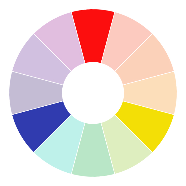
The Color Wheel

A color wheel is a diagram which shows the main color hues and how those colors relate to each other. The most common color wheels feature six or twelve colors.

GBR 5

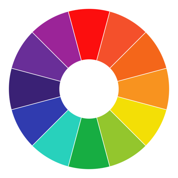
The main colors of the wheel (red, orange, yellow, green, blue and violet) are featured on both wheels, with the potential addition of six extra colors (red-orange, yellow-orange, yellow-green, blue-green, blue-violet and red-violet).

As you can see, all of the extra colors on the larger color wheels relate to the main colors that are already there – effectively, they’re “in-betweens” of the original colors themselves.

Primary Colors

You’ll probably recognize these as being the three primary colors: red, blue and yellow.

GBR 6

Primary colors are the base colors of any color wheel and of the color spectrum as a whole. To create any other color, you’ll have to use a combination of two or all three of the primary colors.

Secondary Colors

These are purple, orange and green.

GBR 7

Secondary colors are created when you mix two primary colors together. These also lie directly opposite the primary colors on the color wheel, as they are in-between the two colors that have been mixed to make this secondary color.

Note: We refer to these opposing, contrasting colors as beingcomplementary – when mixed, these complementary combinations (such as red + green) produce a neutral color.

Tertiary Colors

Tertiary colors are created when you mix one primary and one secondary color together. As such, there are more tertiary colors than primary or secondary, owing to more combinations which can be made.

GBAR 8

On the color wheel, these lie between each of the primary and secondary colors.

Color Families

When I think of color, there are two main elemental families that stick out to me – warm colors and cool colors. A little tip that makes it easy to decipher which colors belong to which family, is to split the color wheel in half.

Warm Colors

Colors that belong to the warm family are colors such as reds, oranges and yellows. These all evoke a feeling of warmth in some way – red is passionate and fiery, and orange and yellow are summery, like the sun.

GBR 9

Cool Colors

Colors that belong to the cooler family are the blues, greens and purples of the color wheel. These naturally evoke a calmer feeling than the other colors, they’re more subdued than warmer colors, linking more closely to water, nature and such.
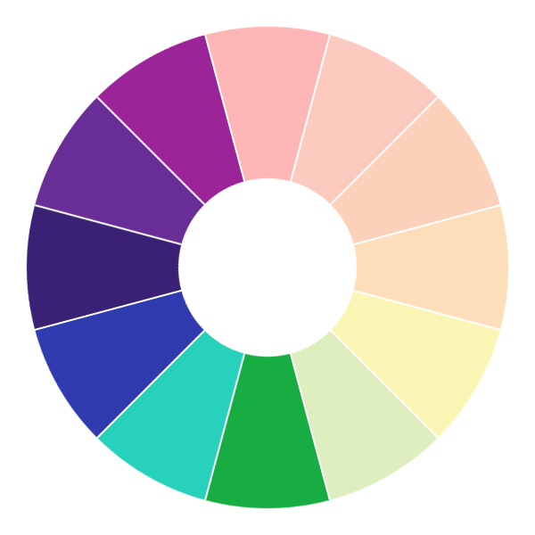
GBR 10

Color Meanings

First up, it’s a good idea to start learning about what each of the main colors mean. It’s important to remember that every color will have a different significance depending on the person you talk to and wherever you are in the world. Don’t forget that as well as the broader population, colors often have personal meanings to individual people or groups. This means that although the classic (or assumed) interpretation of that color may mean one thing, how an individual interprets that color may be completely different.

In web design – or any design, really – you can never afford to make rigid assumptions about your users. However, color is one area where there’s a little exception to be made. As color evokes personal meanings to every individual, you have to try and go with the broader assumption of what a color may mean to your target audience – unless you’re lucky enough to have more tailored research and information that lends itself to choosing color palettes in your project.

You also need to think about how your color will be used – both in a practical sense on the web, but also physically by those who will actually be using your website. Think about accessibility and how these colors could be perceived or seen by those with color-blindness or other visual difficulties. Although it’s impossible to know what difficulties every user will have (and even if you did, there’s no way to design to cater to them all) you can take action to use color effectively but in a way that doesn’t cause further problems for a portion of your users.

Further Reading

Geri Coady wrote a brilliant little book on Color Accessibility and goes into a lot of detail on building color accessible websites. It’s definitely worth a read to extend your color accessibility knowledge.

Introducing Wireframes to Your Design Process

After sketching, there is one final thing you should work on before starting to design (although, admittedly, this is all part of designing). Wireframing is essentially a visual guide to a website which helps you to look at layout without thinking about the aesthetics of the project.

How a wireframe should look will vary wildly, depending on who you talk to. You have many options when creating wireframes – from the way you display your wireframes, to the software you create them with.

When creating your wireframes, you need to be working with layout and with the content that you’ve previously curated. The idea of a wireframe – as a deliverable to a client, or just as an extra step you’d prefer to take – is to be able to display the visual layout and flow of a website page, before you get bogged down with the design details such as colour, typography or any other visual flairs.

Designing Creative Wireframes

The best way to move onto creating digital wireframes for your project is to move directly from the sketching phase. In that section you should have already been playing around with layout, but creating a digital wireframe is a much more professional way of nailing down your ideas on the layout and flow of your web page.

When designing creative wireframes, you want to ensure that you use the real content that you’ve curated nearer the beginning of the project. Personally, I prefer to design wireframes that lack anything that could sway a client into thinking that design decisions are being made that will affect the look and feel of the project. Therefore I always ensure that I design a wireframe that focuses only on the content of the project and the way that content is presented on the page.

GBR 4

An example wireframe created using the Balsamiq Desktop application.

What Makes a Well Designed Wireframe?

Content that is well written and displayed in a manner that is useful and relevant to those that will read it, will always result in a better design and online experience. A well-designed wireframe is one that keeps in mind that the content is the most important thing on the page and is sympathetic to displaying that content in a manner that is suitable for the project and its end users.

The wireframe stage of a project will heavily relate to when you were editing and working with your content nearer the beginning of the project. As a brief example, at that point you’ll have worked hard to ensure that the content would be easy to read by proper use of headings and lists. Designing a good wireframe means transporting that content (in paragraphs, headings, lists and whatever other way you chose to format the content) into your wireframe and looking at how you can start to create visual relationships between each bit of content, connecting the dots until you have a visual representation of how that content could look on a page.

Designing With Blocks

In order to keep your wireframes design-free and content-focused, working with blocks is a really easy way of sectioning off parts of a page for particular content areas.

In a practical sense this means that if, for example, you wanted a standard header at the top of the page, then you would add a block to the top of your wireframe design. If, strictly for example, you wanted to add a logo and navigation area within the header, then you would place additional blocks for these elements inside the header of your wireframe design.

You can then use blocks throughout the rest of the wireframe design, continuing to section off areas for specific bits of content.

Don’t Take it Too Literally

Blocks don’t have to just be a literal monochrome square or rectangle though – once you have an idea of your basic layout with the blocks you’ve added, feel free to use your actual content in places that it will be useful. For example, use the real content for the navigation items, an introduction to a page, the headings and so on. This helps as you can start to see visually how the content works together in the layout you’re creating.

Quick Tip: Label Your Wireframes

When you’re designing your wireframes, always ensure you label the areas or sections that you place in your wireframe. Although you may understand what a certain block denotes (particularly when the real content isn’t placed there), a client or colleague may not and you should make it as clear as possible for them to understand what they are looking at.

Consider the Flow

When you’re designing your wireframes, one thing you should think about is the flow of the page – look at the way the content sits on the page and how it flows from one section of content to another.

The aim here is to make sure that the content reads correctly and that you the eye moves fluidly from one section to the next. This is particularly important when you have content-heavy pages – users should be able to move easily from one section to the next, without it being a jarring experience. If pages are too busy and don’t have the right sort of flow to them, users will be turned off by what seems a difficult to understand or follow process.

One idea is to think of what you would intuitively do when navigating a website – start by looking towards the logo and header, then down to the main heading and following the main content, moving gradually over towards a sidebar and so on.

Responsive Design and Wireframes

When designing a website, it’s near impossible to create a separate wireframe for every single stage that the website might change, how it looks or fits together. Instead, having previously thought about the flow of your design and content, you can look at a responsive flow to the wireframe design.

This was a tip I picked up from Sarah Parmenter’s Responsive Day Out talk, where Sarah explained how she adds numbers to her wireframes that help aid a client in understanding how the content and items may stack when on a smaller screen. This is really useful as it will help a client start to understand about the content hierarchy as well, also meaning that you can start to look at any possible pitfalls or challenges when working responsively very early on in the project – something that may save you a lot of time later on in the project.

Applications and Tools

When designing wireframes, you have a ridiculous amount of choice when it comes to the software that you can use. Personally, I think there are a definite three choices that seem most popular, particularly in the web industry.

Graphics Software (Photoshop, etc.)

When designing a wireframe, possibly the easiest solution is to work with a graphics app that you’re already familiar with – or at least have used a little before. This means there is little to no learning curve, so you can hopefully get on with designing your wireframes a little quicker.

The easiest way to design with your graphics software is to use the shape and text tools, using these to create your basic blocks, as well as specific areas with real content. Remember to label your wireframe blocks using the text tool while you go along.

Keynote and Powerpoint

This may be a surprise to some, as Keynote and Powerpoint are usually used for creating presentations. However, they’re really powerful and easy-to-use tools to create other things, including wireframes. Using the default tools that are available to you in the apps themselves, you can easily create professional-looking wireframes really quickly.

Balsamiq Mockups

My personal preference, Balsamiq Mockups is an app that is dedicated to creating wireframes. This app really makes it simple to design your wireframes and has a lot of resources at your disposal to quickly drag and drop the elements you want to place.

One thing I love about Balsamiq Mockups is that it uses a rough, sketched style that really lends itself to showing that wireframes are just that – an idea of layout that could be translated afterwards into a proper design. You have the option of choosing between a more standard feel to the wireframes as well as the sketched finish, if you feel a client would be more receptive to that.

Handy Resource: User Interface Kits

With the introduction of user interface kits, it’s also really easy to start designing more complex wireframes on a variety of apps. From full kits you can download to use as a PSD in Photoshop, to sets that help you create wireframes in Keynote a lot easier – there’s something there to help you.

  • 50 Free UI and Web Design Wireframing Kits, Resources and Source Fileson SmashingMag
  • Dev Rocketfrom UI Parade
  • WireKitby @adamwhitcroft
  • Keynotopia
  • Keynote Kung-Fu
  • Play around with all three types of ways that you can wireframe, so you can decide which suits your work style and workflow better. The idea here is to just allow yourself a bit of time to become familiar with the different apps that are available for you when wireframing and see which suits you best.
  • Once you’ve found which wireframing solution you prefer, start to create and design your wireframes. Remember to start simple, building up your layout and components to represent the layout.
  • Once your wireframe is complete, create a copy of it and start to think about the “responsive flow” and how each of the elements can stack when the viewport of the site starts to get smaller.

Sketching and Your Design Workflow

Once you’ve finished working with your content – great news! You get to start thinking about the actual design. But not so fast – don’t jump onto a computer straight away.

If you talk to designers, most of them will tell you that it’s a massive part of their workflow to firstly sketch out any ideas they may have.

When sketching, you don’t have to draw really pretty pictures or make sure the sketches you do are neat – the idea is to visually note down as many ideas as possible, as quickly as possible.

Jason Santa Maria put it brilliantly at New Adventures in January 2013 when he said that you can get all the “ugly ideas” down – that way, you get rid of all of the rubbish ideas first, before you focus your ideas into a proper design.

The key to good sketches is to just go with the flow – complete as many as you’re comfortable with and play around with design elements (such as the way that quotes might be displayed, or how to make a feature out of a particular piece of content) or look at how you imagine the rough layout of the design might be.

Experiment!

The best thing you can do with sketching is to experiment. It doesn’t matter if you make a mistake, or something doesn’t look right to you, as you can easily just move on to the next sketch.

At the end of the day, this is something that you are doing that can help you to get a feeling for the design. When you’re new to designing, it’s a great way to ease yourself into the design stage and think in a disorganised way about how things could work.

Top Tips for Sketching

GBR 2

1. Have fun With it

Just pick up a pencil (or pen, whatever takes your fancy) and paper and play around with ideas and sketching. Most of my sketchbooks look shocking, full of messy scribbles and ideas – but that’s okay.

2. Explore Your Ideas

The main point of sketching is to get ideas down and explore any ideas you might come up with further – whether that’s through more sketching and playing around with layout or through researching something a little more thoroughly.

There are mostly three kinds of ideas: ideas that are great from the beginning; ideas that need a little work (or a lot of work!) to go from mediocre to good; and those ideas that are just plain bad and won’t work.

Remember that exploring your ideas means taking a good look at both your good and bad ideas and working to improve them. Taking the time to experiment and explore your ideas means that you’ll start to understand how your ideas fit into the above categories. Basically, the more time that you spend playing around with your ideas and seeing how they can be improved – or if they should be – the more that you’ll start to see what makes a good idea and when to put that extra effort in.

3. Document Your Ideas!

One of the best things you can do with sketching is to document and write about what you’ve done. This is as easy as writing the tiniest bit of information about what you’ve done at the side (but add more, if you want to).

GBAR 3

The reason I suggest writing about your ideas (or at least the ones you like or prefer exploring more) is because it helps to have a clear explanation of your idea at that moment in time, in case you come back to it later and either interpret that idea differently (which is sometimes brilliant and can move an idea forward) or completely forget what it was about.

Further Reading

  • Sketching: How a Simple Pen and Paper Can Transform Your Web Designs
  • The Role of Sketching in the Design Process
  • Sketch out ideas for your next project – start playing with ideas for typography, form, layout and more. Be as creative as possible and don’t restrict yourself to one particular style or look – try to have fun with it and be as wacky and imaginative as you can.
  • Once you’ve sketched out lots of rough ideas, try refining a few more and exploring certain ideas you like in more detail. Then, try annotating your sketches, explaining and justifying the decisions you’ve made and the ideas that you have.

Assignments

  • Sketch out ideas for your next project – start playing with ideas for typography, form, layout and more. Be as creative as possible and don’t restrict yourself to one particular style or look – try to have fun with it and be as wacky and imaginative as you can.
  • Once you’ve sketched out lots of rough ideas, try refining a few more and exploring certain ideas you like in more detail. Then, try annotating your sketches, explaining and justifying the decisions you’ve made and the ideas that you have.

Researching Your Design Project

When working on any project for the web, you should always start by researching as much as you possibly can. To be honest, you can do as little, or as much research as you’re comfortable with, but I honestly feel that researching more will only benefit you when embarking on your project.

In its most basic form, research informs you about:

  • competitors
  • your client’s industry
  • audience
  • goals
  • relevant design styles

and so on.

Often, you’ll find dedicated teams (both within agencies and in-house) which concentrate on tackling this area of a project alone.

However, if you’re working by yourself, possibly as the design lead on a project, then it makes sense to keep yourself as informed as possible. Research is just one way to do this and all it requires is to take your time.

What Makes Good Research?

It takes time to become really adept at researching. Always remember to ask your client as many questions about a project as possible – and this can easily class as part of your research phase. It’s all about understanding what your client wants and tailored questions will help you get more of an idea of the style they may be after, the target audience they want to reach, an idea of their competitors, what it is they like or dislike about competitors… and the list goes on. Pose as many questions to clients as you can – the more informed you are, the more sound your decisions will be.

If you’re not working for a client and are instead working for yourself (on a personal project for example) then try to carry out all of this research in a similar fashion – ask yourself the questions you may normally ask a client and put yourself in that position so you can flesh out your understanding of the project at a deeper level.

Why Bother Researching at All?

Research is important because it helps us to step away and look at the project on the whole from a distance – we can start to look more at individual components that matter.

It might also be the case that clients are smitten with a particular competitor’s website – or just any website that they’ve seen, in fact – and researching that site and understanding why they love it so much may be key to making a breakthrough later on when you’re stuck into the actual design itself.

Either way, the research isn’t there to make your decisions for you – it is there to aid you in making decisions further down the line. It’s important to make sure that you’re researching to get a better understanding of your client, their industry and their work, without it impacting on the decisions that you make – at the end of the day, research is there not to force you to commit to decisions, but to help you.

Assignments

Before moving on to the next part of this session, apply yourself by trying out these assignments.

  • Compile a questionnairewhich you can present to clients when embarking on a project. This questionnaire can be refined and tailored to different clients as time goes on, but a basic set of questions can be an invaluable time saver.
  • When getting used to researching for projects, it can be a good idea to start close to home. First off, start researching around something that relates to you. It could be researching agency or freelancer sites, or researching an industry for a particular side project you may have.
  • Once you’re happy with researching subjects that you understand well, try to take it a step further and start researching using the content you’ve previously prepared. This will get you used to trying to get better understanding of industries, people, habits and techniques that aren’t familiar.


Planning a Design Project

Before you start designing, there are several things you should look at first. I always find these extra initial steps help when you eventually do start diving into designing for your next project – and even though these tasks add a little time to the beginning of a project, it will be more than made up later on down the line.

The first thing you should start to do when you’re working on a new project is plan. I can’t stress how important the planning stage is – when you have a project that is well planned, it’s much more likely that the project will run smoothly and without as many problems or challenges.

The main things you need to think about when planning are related mostly to content – the content that you have to work with (hopefully the full, real content that will be in use on the site), how the content hierarchy works and fits together, a website site map and more. However, as well as all the work to do with content you may want to start looking at the structure of the project, workable deadlines and the scope of the project.

Working With Content

It’s super important when designing sites to abandon the Lorem Ipsum (or alternative filler text) and work with real content. This sometimes isn’t always possible, but as a freelancer I always push for the client to provide me with the content they’re wanting on the site.

If you don’t work with real content then you run the risk of designing without proper context, and without that you can’t make design decisions that will benefit the users and their experiences when interacting with your website.

When working on a design, working with real content means that you can see how this content interacts with the other design elements on a page. This is even more important with the introduction of responsive design – as we can see how the real content interacts and responds at particular viewports and sizes.

Sorting Content

Once you have the content in front of you, the first thing you want to do is analyse it and see if you can spot anything that needs changing or removing. You’ll likely have been supplied the content in what the client deems to be separate pages – so homepage content, about page content, etc. – but if not, then you’ll want to aim to start doing that yourselves.

Sarah Parmenter briefly touched upon this at Responsive Day Out in Brighton in March where she talked about analysing content in a traffic light system.

Whenever Sarah and her team receive content for a project, they go through and assign three colours to the content: for content they want to keep they mark it as green and for content that they know is unnecessary or is unneeded they mark it as red – and that content is removed. Those bits of content that end up in between the two extremes are marked as orange or yellow (or amber, if you’re into traffic light specifics!), to be looked at again in discussions with the client.

I think this is a really good technique to quite easily sort through content that you receive – it’s quick and very easy to visually look through and spot which bits of content you need to pay attention to.

When you’re sorting content, you also want to try and think about the relationships between all of the content. Like you would when developing a site, look to see if you can spot any modular or common patterns to the content and keep these in mind.

Content Hierarchy

Hierarchy is described as “a system or organisation in which people or groups are ranked one above the other” – and this relates exactly to how we can work with content hierarchy. In ideal terms, what we are trying to do is create a system that works to display our content in a meaningful and useful way.

When you are sorting through your content, ensure that you are always thinking about how the content relates and will be laid out – here you really want to think about making the content as easy to digest as possible. Think about using headings, lists, quotes, imagery and more to break up the content and make it easier to communicate more focused messages to the users.

Sitemaps

Having sorted through the content and making any relevant changes as you go along you should hopefully end up with a finished heap of content to work with. Once you’re happy with the state of the content, you need to start looking at how this content will work on the website itself.

gmb 1

This is a basic sitemap created using MindnodePro. If you have a small website (such as this) it’s sometimes an idea to add the elements you want on a page in the sitemap as well.

You can choose to create a site map once you’re happy with your final content but feel free to use them at the very beginning, as soon as you have the original, supplied content.

I find site maps great – they’re a brilliant visual aid to see the state of the website, how many pages there might be and the relationship between all of the pages. This can often be more easy to see through a site map, as you get to remove all of the clutter that pages of content can bring.

Creating a sitemap is a great example of where good planning will help you throughout the lifetime of a project. The great thing about sitemaps – whether you use a bunch of post-its on a whiteboard or create one digitally – is that it makes it really easy to spot where potential problems could be and have the power to fix them before getting stuck into the design.

Assignments

  • Working with some real content (it can even be from a past project), go through and usethe traffic light system on the content. Remember, eliminate unnecessary content, keep content that works well and mark any you’re unsure of for future referencing.
  • Putting into practice all the tips on site maps, create a sitemap with the content you’ve just been working with. Remember that when sorting your content you are looking for common elements and modules of content, just like you would with chunks of code. Do your best to section off all the different parts to your content to create a sitemap with all of the individual pages you think will be required on the website.


Everyone Thinks Differently

“Judge a man by his questions rather than by his answers.” – Voltaire

Everyone solves problems differently and each has his own way of thinking. As designers, the way we think impacts how we design and how we provide our clients with solutions. In the creative industry it’s important to master different thinking styles and the great news is that anyone can switch easily between them. The only problem is that you are probably more effective in one style of thinking than the others.

To keep it simple, you often think in three specific ways:

  • logically,
  • practically,
  • or creatively.

What does this mean in reality? Logical thinking often involves making judgments. You make a rational decision as to why something is more or less suitable. For example, this could involve choosing a certain design style, declining work or defining the needs of a customer.

Practical thinking is often the most difficult. It determines how you interact with people and how you are able to communicate with and convince others. If you’re exceptionally good at selling websites for example, then you’re probably a great practical thinker. Putting your logical thinking to practice will encourage practical thinking.

Creative thinking involves problem solving. The difference between creative thinking and logical or practical thinking is that you often look at the problem from an unorthodox perspective and your thoughts are less structured. It often passes through several phases and this is considered the creative thinking process.

The Creative Thinking Process

Although creativity is often somewhat unstructured, there’s a definite recognizable process.

Untitled-1

This process is heavily individual, however. The steps may be the same, but how they manifest themselves is entirely unique to you. In particular, the length of each phase, the methods used in each phase and the efficiency of our creative thinking process in general varies greatly from person to person.

Understanding this process is very important when combatting creative block; certain problems can often be linked to a specific phase of the process. Identifying the phase during which your creative block reared its ugly head is the key to solving the problem.

Step 1: First Look

We’ve spoken of problems quite a lot; as designers we encounter them on a regular basis.

“Invest a few moments in thinking. It will pay good interest.” – Author Unknown

These problems may appear obvious: “I don’t have a website and I want one, could you make me one?” In fact, describing the problem in such a way that it includes everything necessary to provide a great solution, is difficult. Why does the customer want the website? What is the target audience for the website? What is the purpose of the website? A good problem is extensive and makes the creative process easier since you’re no longer expanding the problem during the solving.

Defining the exact problem is creative in itself. One of the functions of creative thinking is not just solving the existing problem, but also discovering and providing deeper questions to answer. It’s this first insight which is important to help you understand why you need to be creative and defining the full problem helps you pin-point the correct solution

Step 2: Saturation

The second step we unconsciously go through is in saturating the mind. Simply put, you gather as much information as possible which helps with solving the problem. Fairly typical for this phase is that it’s quite rational and analytic. It’s often the phase which is the least creative.

You can compare this phase to a big puzzle with all the pieces scattered across the table. You already know that some pieces might not be included in the final solution, but what lies in front of you will form the start of the solution for your problem you’ve defined in the first phase.

Knowledge is your foundation for creativity.

This information often includes inspiration gained from other designers, tutorials, books you’ve read but also general things which inspire you like music, for example. This remains quite a strange aspect of creativity: you often need to know how other people have solved similar problems, before you’re able to deliver your own solution.

Being able to find solutions without the need of inspiration suggests someone who’s incredibly independent. Toward the end of the session, we’ll have a closer look on being original in your work.

Step 3: Incubation

Having collected enough information to solve the problem, you start thinking of possible solutions (often a slow process that requires time and patience).

A typical hurdle during this phase is being consciously aware of the fact that you are searching for a solution. Pressure may adversely affect your creativity, causing the much-detested creative block.

Using our metaphor of the puzzle, during this phase you are slowly attempting to fit the pieces together. Some pieces fit, others don’t and sometimes you end up restarting your puzzle. For many people this is the most difficult phase and in general you’ll always encounter some blocks while you process the information from phase two.

For Example

Trial and error during the development of a website is a great example. Rarely do you hold on to your first draft of a website. Design is something that lives and redevelops a number of times during the design process. These changes, reworking and interpreting information differently are typical of the incubation phase.

Step 4: Relief

Creativity is often a sudden stroke of genius, when all the pieces finally fall into place (there’s that puzzle again). Your solution meets all conditions and is achievable!


“My ideas usually come not at my desk writing but in the midst of living.” – Anais Nin

Often, this phase happens at an unexpected time while you’re not concerned with the problem – such as while showering, or having a dinner, or just watching television.

Often it’s an association between two elements that had nothing to do with each other at first sight, that provide your solution. This leap forward in thinking can be difficult, as it requires the incubation of the information you’ve processed. However, you can train yourself in reaching the relief phase faster, by working on your creativity in general.

Step 5: Verification

During verification, your solution gets tested in reality.


Success isn’t always easy to measure; does the problem desist when the client is happy? When the needs of the users are met? In general, it’s good to assume that your first design is never perfect. Dare to be critical of your own work as it will only make things better.

Does it stop after this phase? It might, but usually you’ll repeat certain phases during creative thinking. After verification, you might conclude that your solution is not really suited and you fall back to the incubation phase, for example. Even worse, you understand that you are approaching the problem in the wrong way and you start again from the beginning. Important to realize is that there is never a useless phase. You always learn something from every step you take.

Example

One example could be that you deliver a website that makes both you and your client happy, but that users have some problems finding specific content. In that case you have failed to provide the full solution, as providing the needs of the users is a requirement. Once you notice this, you restart with thinking how you could improve the navigation of your website. In other words, you return to the incubation phase.

The Creative Process in Your Workflow

This article should have offered a foundation for solving potential creative block, and the ability to respond to certain phases of the process more effectively.

For example, during the saturation phase you could create a more efficient structure to guide yourself. I like to start with an hour brainstorming after I’ve read a client brief, absorbing as much information as possible during this limited time span. I try to become aware of as much as possible before I rewrite the brief to include even more details. After the saturation, I shut down my computer, I take pen and paper and develop concepts that way. Again, within the limited time span of an hour.

Understanding the creative thinking process helps you to define your strengths and weaknesses. This can be particularly useful when working in a team. Some people are great at the verification phase and are able to offer useful criticism, other people are great at the incubation phase and are able to offer the first steps towards the final solution. Cope with the weaknesses of yourself and your team by compensating for and complimenting these tendancies.

Conclusion

This concludes the creative thinking process. I hope you found it interesting and it makes you understand how we exactly work when we’re creative. In the next article we’ll raise the stakes and explain what a creative block is, what the different types are and how we can solve this. These will be our first practical steps in making you more creative. Try to stay creative every day, and feel free to leave behind a comment about what you’d like to see in the coming articles!