When you look at beautiful digital art and compare it with the things you draw with a pencil, you can feel astonished and belittled. If only you could afford a graphics tablet, you could be just as good! And if you already have a tablet, your thought is, “If only I could afford Photoshop! So many amazing things can be done with this software.”
This is probably why there’s a misconception that digital art isn’t real art. After all, a real artist needs to learn all these hard things, master pencils, brushes, color mixing, different kinds of pigment, and they can’t just undo a mistake! And when they finish, their art is one of a kind, it exists physically, it’s not just an array of digits that you can copy infinitely. At the same time, a digital “artist” buys some expensive equipment and that’s all—they can now produce outstanding art. That’s cheating, isn’t it?
If that’s your point of view, keep on reading. If you’ve never tried digital art, you’ll learn what it’s about. If you have, but you’re poor at it, I’ll tell you why. In both cases I’ll clarify the misconceptions that may have been bothering you for a long time.
Sculpting, Drawing, Painting, Digital Art
There are lots of methods of recreating the real world in some small form. You can take a soft mass and mold it. You can take something harder and sculpt it. You can make thin rows in sand to represent the outlines of something. You can take a sheet of white paper and create smudges with a small bit of charcoal. You can make blobs of color to imitate patches of light and shadow. The weird thing is that we don’t have a word for all these activities. It’s not really “creating”—we don’t create a thing, we create an image of it. In the end, we tend to call it sculpting (for built forms) and drawing (for shapes on paper). People more familiar with art add another category to it, painting, to distinguish it from line-based works.
Not so long ago another category appeared—digital art. The computer has turned out to be a powerful tool for an artist. It provides a clean workspace, with the freedom to make mistakes. It’s so powerful that traditional artists have started to look at it as some kind of unfair extension. One pen instead of a bunch of pencils with different softness, all the brushes that need to be cleaned all the time, charcoal, ink and whatever you’d like to use? One machine for every size, shape and material of canvas, for every color and way of blending? Everything neatly placed on your desk, with the option to save for later? A dream tool for lazy people!
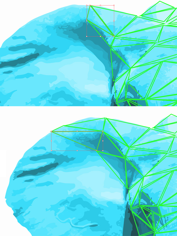
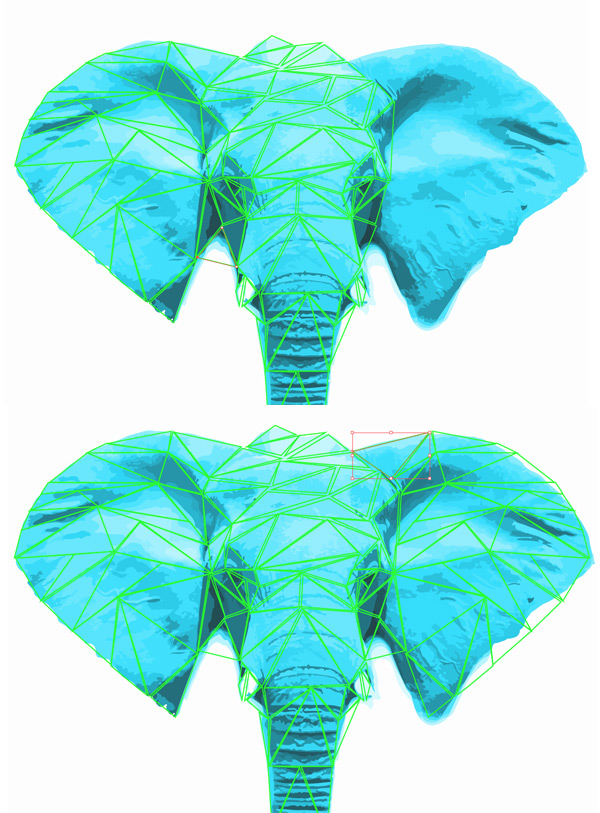
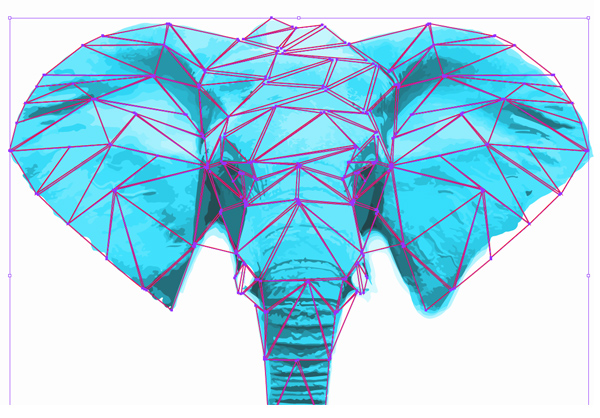
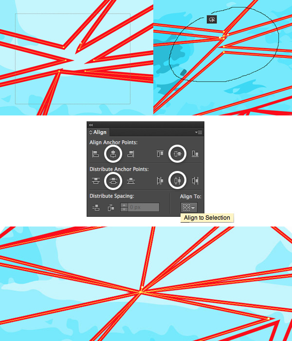
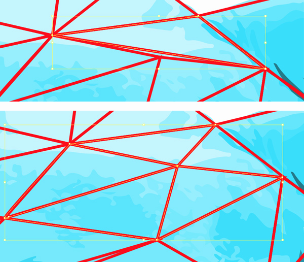
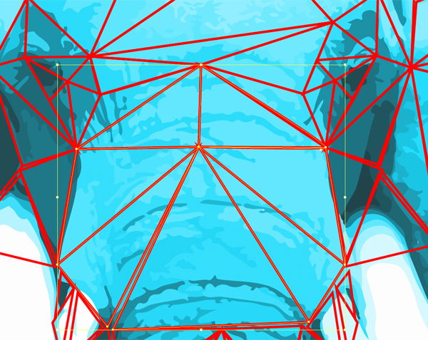
Computers are also well known for their function of automating boring and time-consuming processes. For example, you give it ten big numbers to multiply, and get a result without any effort on your side. In the same way you can create a brush (one not similar to anything traditional) of a tree, and create a whole forest with simple clicks. Click, click, click—and there you are, every tree perfectly detailed. All in a matter of seconds. Want to create a gradient for the sky? No problem—select white and blue, and it just creates itself. Did the character turn out to be too small? Don’t worry, just scale it. Or use a special deform tool to change its shape without having to draw it again. Everything without affecting the background—we’ve got layers, after all. It’s too easy. Too easy to be called art.

Try to do the same with traditional painting!
Here’s the problem: a computer isn’t an art tool. It’s not a substitute for a brush, or canvas. It’s a set of tools that lets you create an image of reality in the same format as photos. That’s all. Does it make the creation process more convenient? Yes. Does it make it easy? No.
To understand it, you need to get familiar with the concept of art media.
Traditional Media
Sculpting
In sculpting you use some solid material to create a 3D object, usually resembling something known from reality (or imagined reality, like movies or books). These materials should be prone to some kind of crafting so that their form can be adjusted. These are materials like:
- Clay
- Stone
- Metal
- Plastic
- Bone
- Wood
- Ice
- Glass
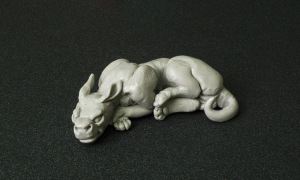
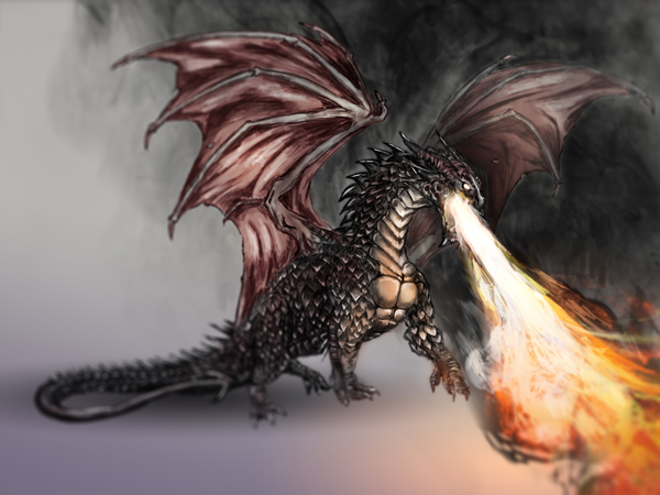
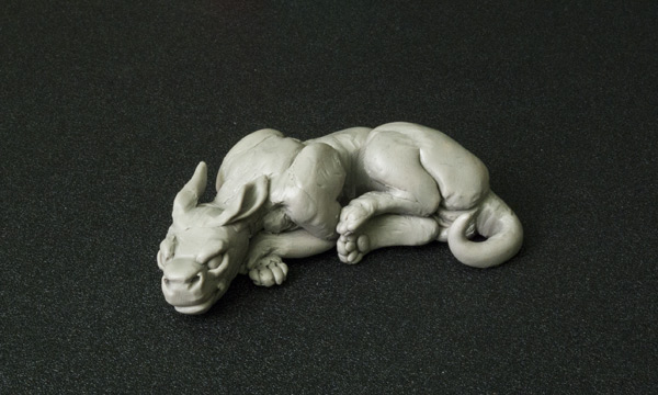
Sculpture—Super Sculpey polymer clay, toothpick
Drawing
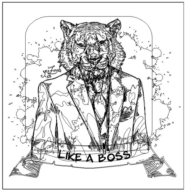
In this method the outcome is made of lines that symbolize some form known from reality. It’s characteristic that dry media are used—you need to make the blending yourself with lines or a kind of dithering. Almost any material can be used for it, as long as it’s applied with a pointed stick on a material that can keep it for a time (paper, wood, or the human body).
- Graphite
- Marker
- Ink
- Crayon
- Paint
- Pastel
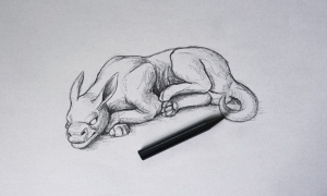
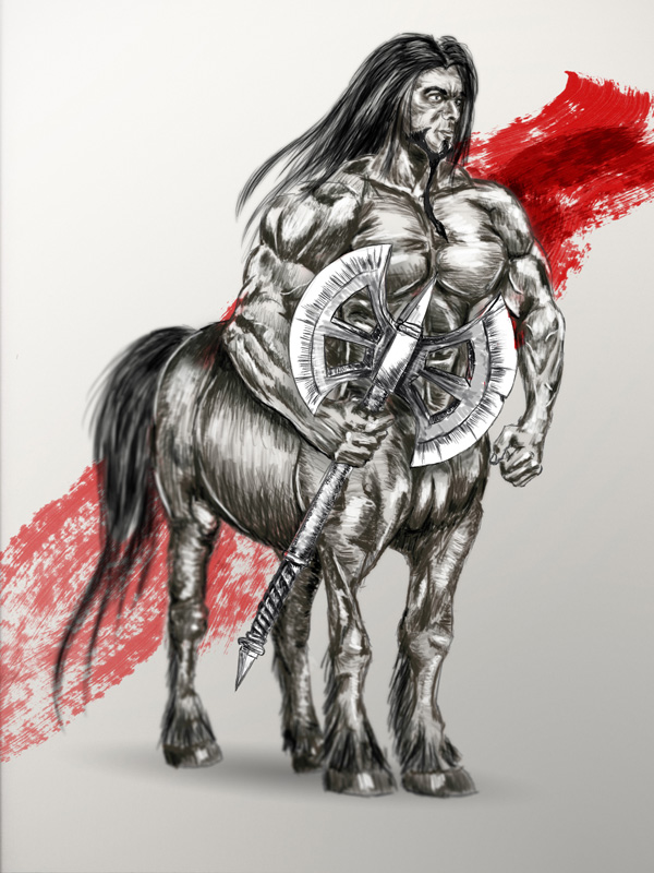
Traditional drawing—Progresso woodless pencil, 8B
Painting
In English, “painting” and “drawing” are often used as synonyms. However, a simple distinction can be that we use sharp lines for drawings and blobs/patches of paint for paintings. Overall colors, light and shadow, and the shapes made by it are more important here than clear outlines. Wet media are usually used, and the blending tends to occur naturally. For painting we can use:
- Oil paint
- Acrylic paint
- Gouache
- Ink
- Tempera
- Watercolor
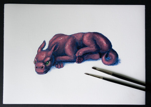

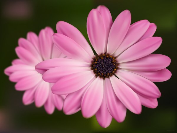
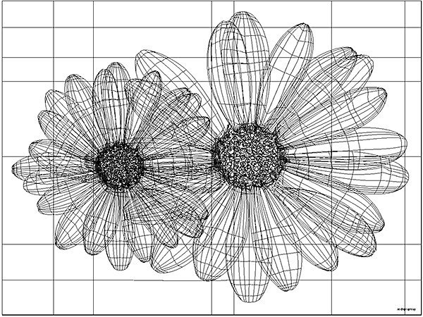
Traditional painting—acrylic paint, canvas paper, two brushes
Digital Media
Digital media will be everything that has a digital outcome, that is, “in the form of digits”. When you take a photo of your painting, it becomes digital too (of course, only the photo, not the physical original). That’s what links all digital creations—nothing more. We still can distinguish other categories here:
Sculpting
Digital sculpting is about creating 3D models of something known from reality with a software that provides tools for it. The models can be textured and colored, and presented in a light that resembles a realistic environment. Finished works can be brought into a traditional form with a 3D printer.
Drawing
Digital drawing can be created with software that lets the user create dots of various diameter, which transform into lines. Additionally, other features can be used, like colors, erasers, and the transformation of drawn lines. Finished works can be then brought into the “real world” by printing.
Painting
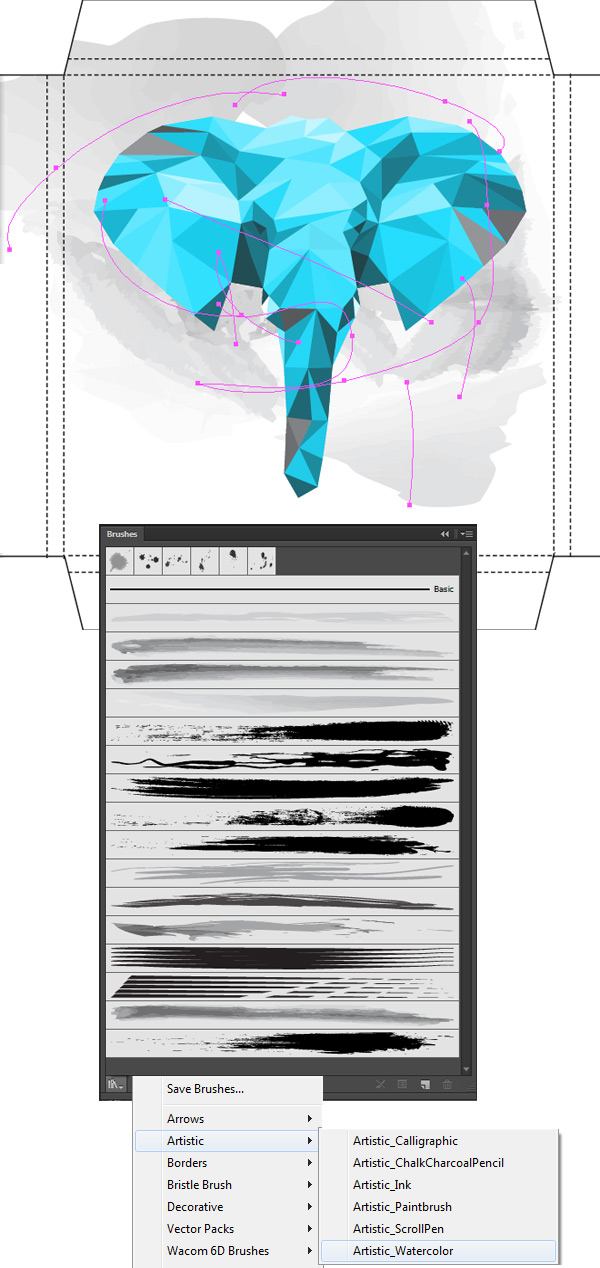
Digital painting requires software that provides tools for creating patches of color and for blending them. Painting programs are usually a more advanced form of drawing software.