In this tutorial, I’ll show you a potential process for approaching a simple illustrative logo design project. We’ll go through the steps you can take to develop ideas, refine your logo work, and experiment with different looks for a logo.
I’ll give you a few tips along the way about some techniques you can take advantage of in Adobe Illustrator with a Wacom tablet, creating great hand-drawn looking illustrations with pressure sensitive brushes.
1. Sketching
Sketching out a bunch of rough concepts lets you hash out a variety of ideas for a logo, and explore a few visual directions.
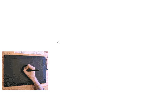
A lot of designers will grab a notebook and draw ideas by hand, but a fantastic way to enhance the speed of your work is to sketch directly into Adobe Illustrator with a tablet. Your sketches will be vector-ready, you can drop them right into your final document as a reference, and, with lots of pressure sensitivity, there’s no detail lost.
Set Up Your Sketching Document
I recommend starting out with an A4 size artboard in Adobe Illustrator, so that you can easily print out your roughs if you need to show them to a client.
If you select the Artboard Tool (Shift-O), after you’ve created your document, you can hold Alt and drag on the first artboard to duplicate it. This way, you’ll have a bit more space to work with, and you can print out each artboard as its own page.
Using Pressure Sensitive Brushes for Sketches
I’ve set up a single pressure sensitive brush for sketching, just so I have a bit of control over the weight of my lines. I use the Blob Brush Tool (Shift-B) for this sort of sketch work in Illustrator.
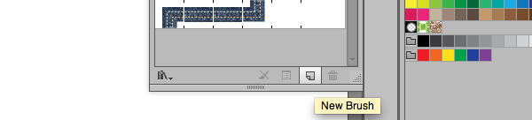
You can create a new brush by opening the Brushes panel (Window > Brushes) and clicking the New Brush icon.
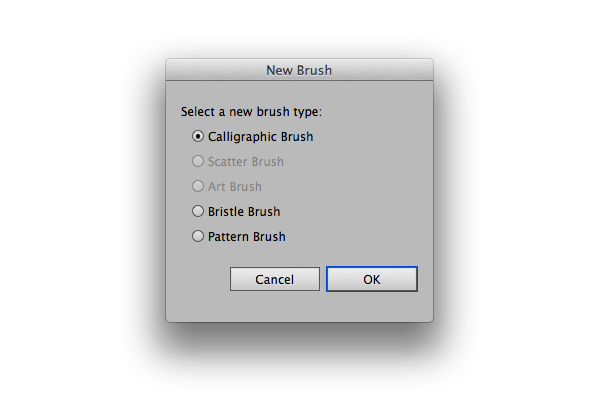
Select Calligraphic Brush in the dialogue that appears.
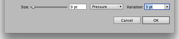
To give the brush pressure sensitivity, we have to select Pressure from the dropdown next to the Size slider.
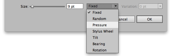
Then, define the amount of variation to the size of the brush. For sketches, I find it’s better to have less variation, to simulate more closely using a pen or pencil.
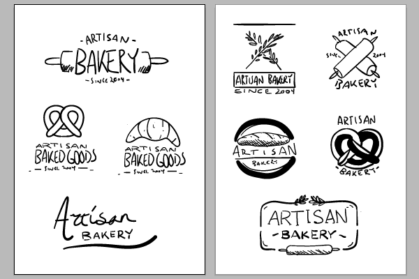
Here’s how my document looks after sketching out some ideas with the tablet using the Blob Brush Tool (Shift-B), and the pressure sensitive brush:
2. Refining Sketches and Exploring a Concept
After you’ve sketched out a bunch of ideas, it’s time to refine and explore a particular concept.
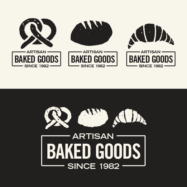
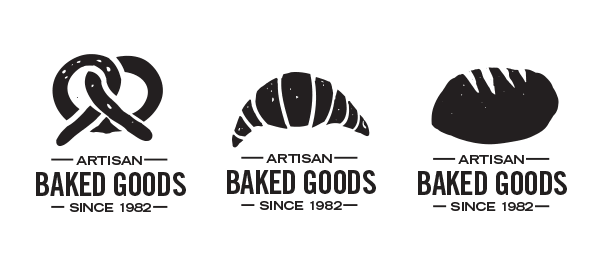
In this instance, I’ve gone with an idea built around illustrations of baked goods. Depending on the product, the packaging would have a different illustration.
Taking the initial sketches, I roughed out the type and settled on a layout.
3. Illustrating the Logos
Now, we’ll illustrate the logos. Adobe Illustrator, just like Photoshop, allows you to assign different brush parameters to different tablet input types.
Set Up a Brush
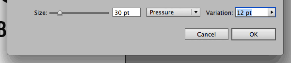
We’ll need a thicker brush to draw out the complete logos. Create a new Calligraphic Brush using the same steps from the previous section, this time setting the size to 30pt and the pressure variation to 12pt.
Draw the Icons
I’ve kept the illustration style loose and rough. For each illustrative logo I use the Blob Brush Tool (Shift-B) to create the basic shape. Then, I flip my tablet pen over and use the Eraser Tool (Shift-E), or the Knife Tool to refine the shape and carve out details.
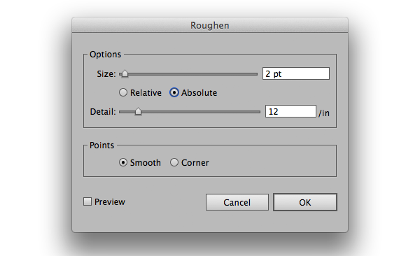
After drawing each icon, I’ve added a roughen effect to give edges some character. You’ll find the Roughen effect under Effect > Distort & Transform > Roughen. The settings I’ve used are:
- Size: 2pt, Absolute
- Detail: 12/in
- Points: Smooth
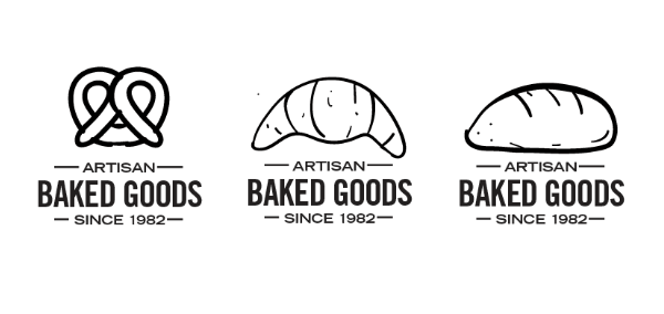
After roughening, this is how the illustrations look:

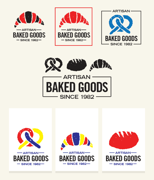
4. Different Color Treatments and Layouts
Once you’ve created the base assets for your logo work, you can experiment with different color treatments and layouts.
Since everything we’ve done so far is vector, it’s trivial to modify colors and adjust positioning.
Conclusion
When your design brief calls for visuals that feel handcrafted and homely, you don’t need to sacrifice vector versatility for texture and grunge. You can use tools that already exist in Illustrator and the power of a tablet to give life and character to your work.