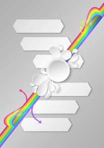
Let’s play with Linear Gradients in this abstract poster design. Fire up Adobe Illustrator (I’ll be using Illustrator CC 2014) and get ready to doodle out some rainbows, curving arrows, and paisley-like splash designs.
1. Set Up Your Document
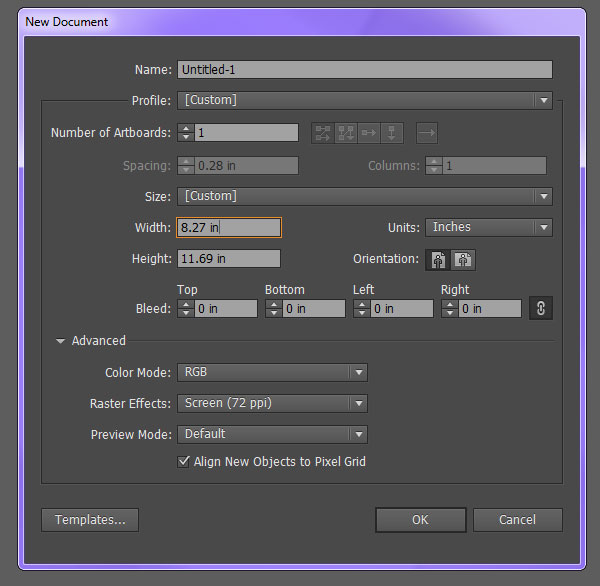
Step 1
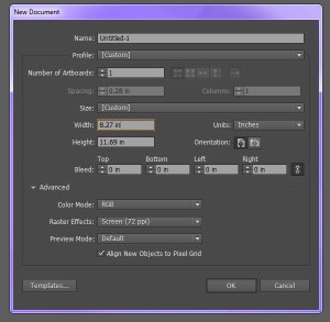
Create a New Document. It’s your call on the size. I ultimately wound up with a design of 8.27″ x 11.69″. If you’re keen on keeping your design at print resolution, make sure the ppi is set to 300. Otherwise, 72 ppi will do just fine.
Step 2
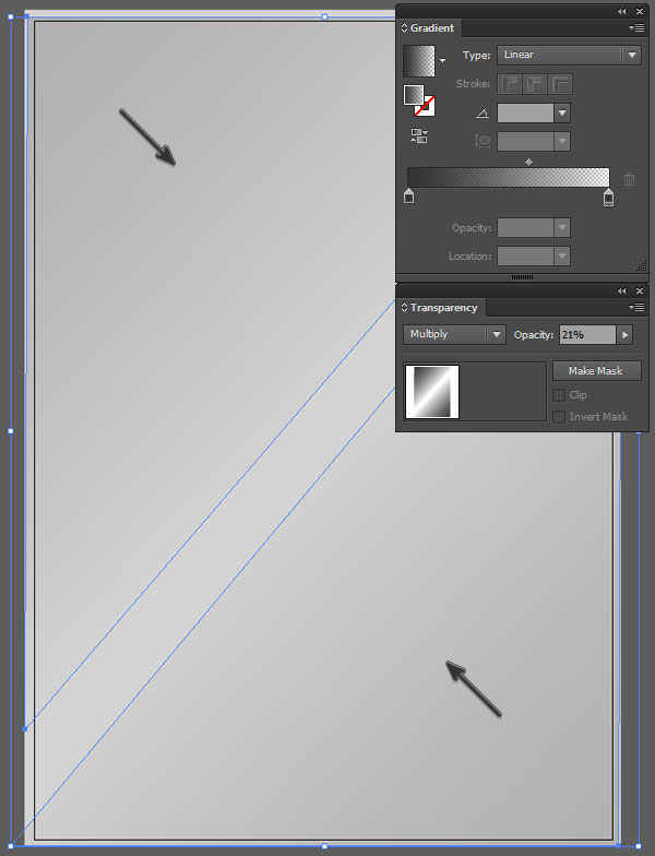
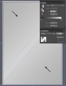
Use the Rectangle Tool (M) to draw a large light gray rectangle over the Artboard. Draw two triangles that cover most of the design space (one over the top left and one over the top right). Apply a Linear Gradient that goes from dark gray at 100% to 0% Opacity. Adjust the angle of the gradient with the Gradient Tool (G) so the darker color is in the corner of the design. In the Transparency panel, set the Blend Mode to Multiply and Opacity to 21%.
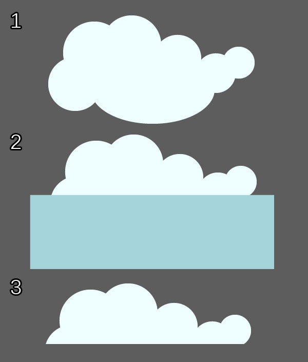
2. Background Shapes
Step 1
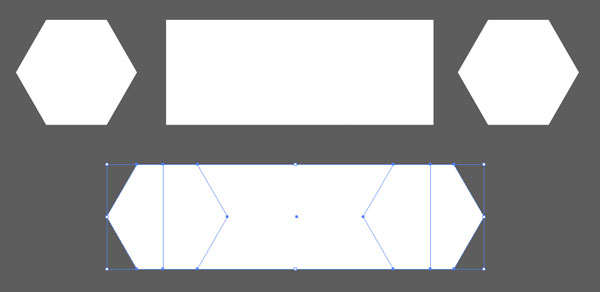
The white banner-like shapes in the background of the design are fairly simple. Use the Polygon Tool to draw two hexagons (of the same size) and the Rectangle Tool to draw a rectangle of the same length as the hexagons. Place the hexagons on either end of the rectangle (see below). Group (Control-G) these shapes together.
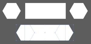
Step 2
Copy (Control-C) and Paste (Control-V) the banner-like shapes so you have six of them placed in a V over the artboard. Group all the shapes together and place them beneath the triangular gradient objects from Section 1, Step 2 in the Layers panel.
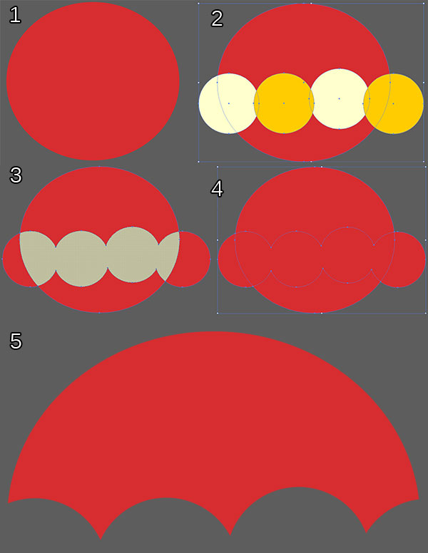
3. Draw the Central Design
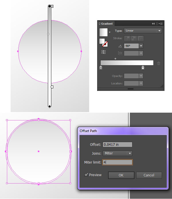
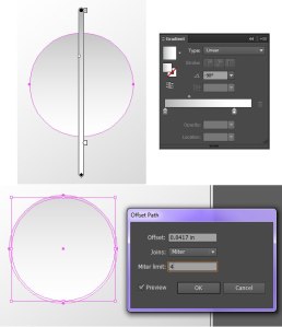
Step 1
Draw a circle with the Ellipse Tool (L). Apply a Linear Gradient at a -90° angle that goes from light gray to white. Select the circle and Offset the path by going to Object > Path > Offset Path. Offset the circle by 2–4 pixels. Set the fill color of the new shape to white and make sure it is behind the smaller gradient circle in the Layers panel. Group the two shapes together.
Step 2
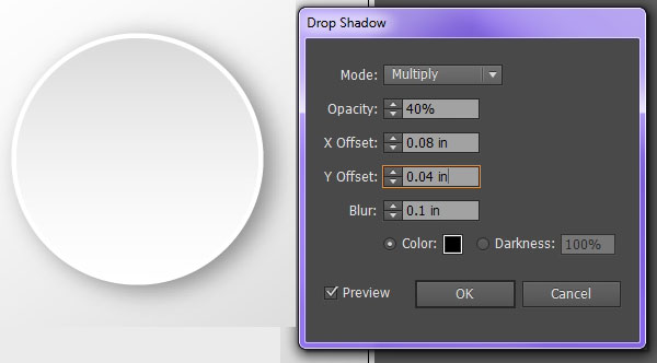
To apply a Drop Shadow to the circle group, Select it and go to Effect > Stylize > Drop Shadow and add the following attributes:
- Mode: Multiply
- Opacity: 40%
- X Offset: 0.08 in
- Y Offset: 0.04 in
- Blur: 0.1 in
- Color: Black

Step 3
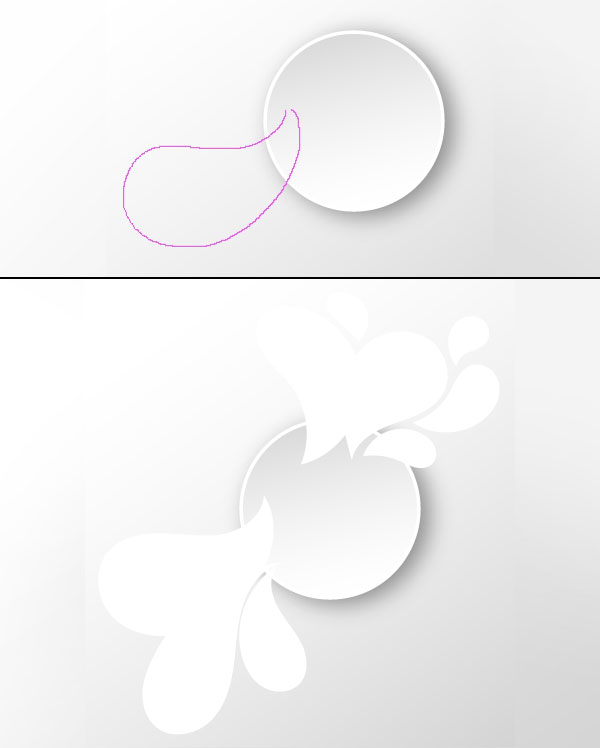
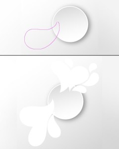
Use the Pencil Tool (N) to draw curving, paisley-like designs around the dimensional disc. If you’re using Illustrator CC, you can adjust the Pencil Tool Options so the Fidelity of the tool is Smoother, and you’re more likely to have clean shapes. Draw several of these going diagonally from the top right to the bottom left of the design.
Step 4
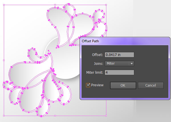
In total, I drew 14 of the white splash shapes. Select all of them and Offset the shapes by 2–4 pixels. Apply the same gradient from Step 1 in this section to the smaller of the shapes. Set the fill color of the offset shapes to white. Group all of the splash components together and place them below the white disc group in the Layers panel.

Step 5
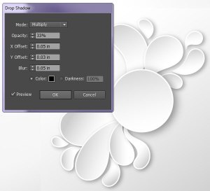
Once again, we’ll apply a Drop Shadow to the design. Select the splash shapes, go to Effect > Stylize > Drop Shadow, and add the following attributes:
- Mode: Multiply
- Opacity: 33%
- X Offset: 0.05 in
- Y Offset: 0.03 in
- Blur: 0.05 in
- Color: Black
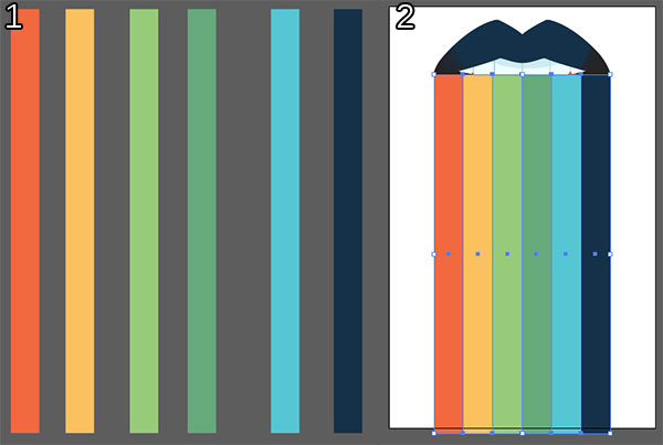
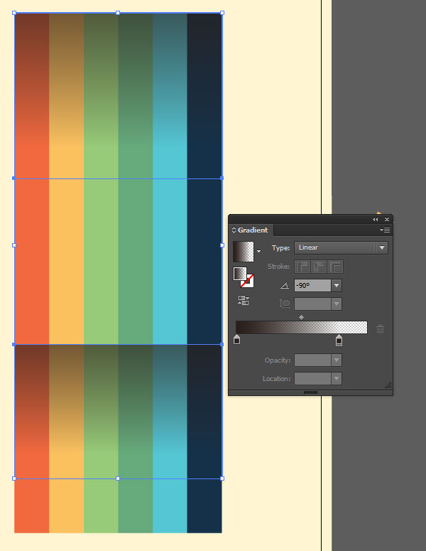
4. Create the Rainbow
Step 1
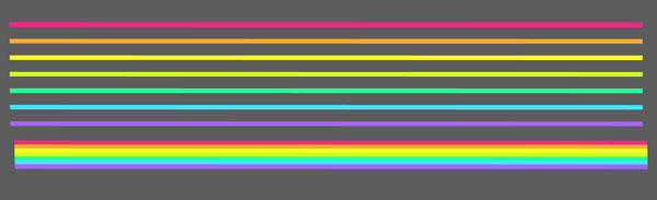
Draw seven thin rectangles of the same size in seven different colors (pink, orange, yellow, green, teal, blue, and purple) and Align them together so they’re evenly spaced in a rainbow strip. Group the rectangles together and Rotate the group so it stretches across the Artboard diagonally.

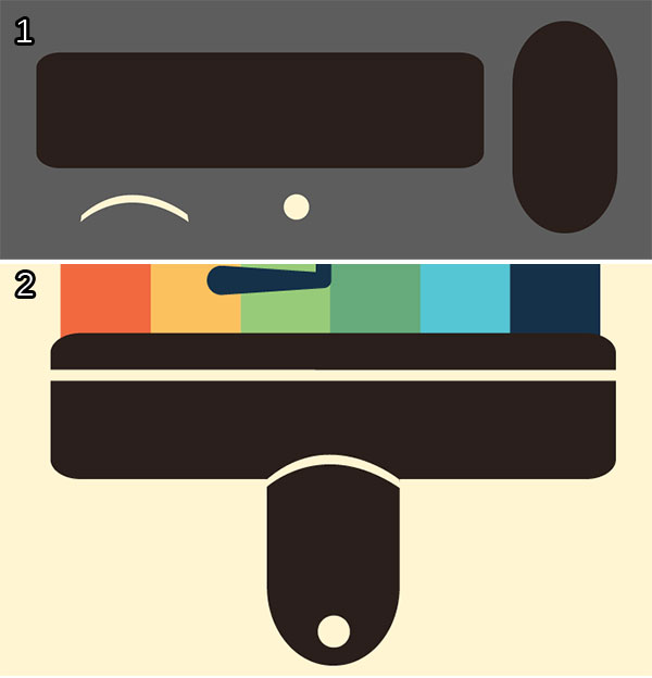
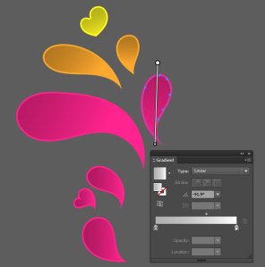
Step 2
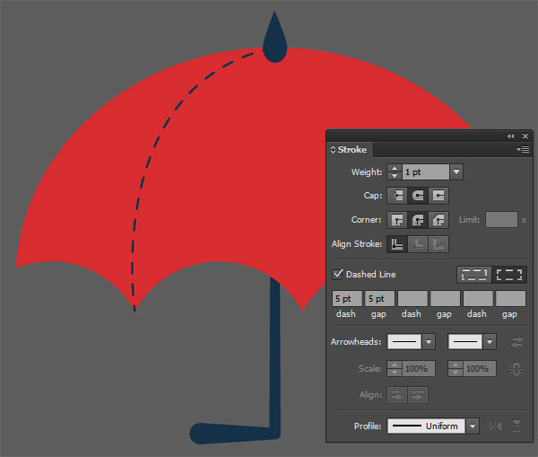
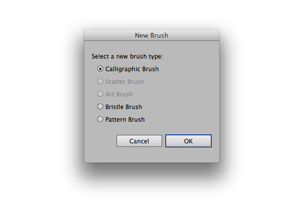
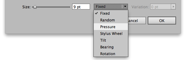
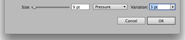
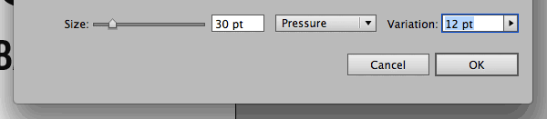
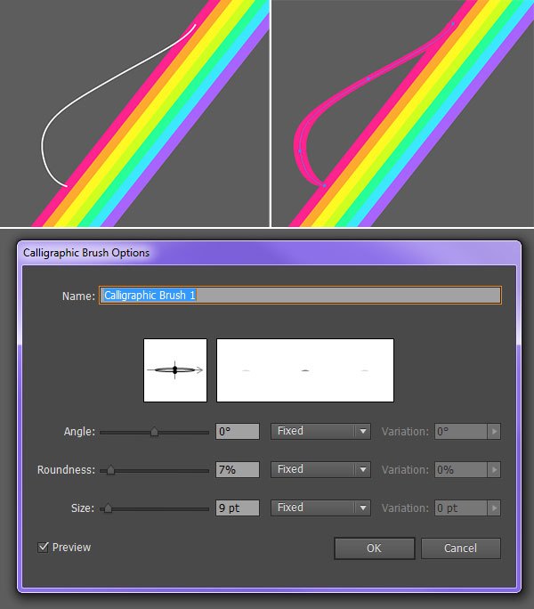
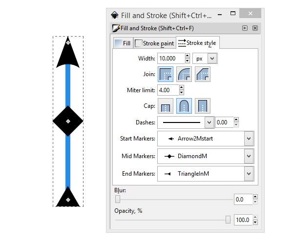
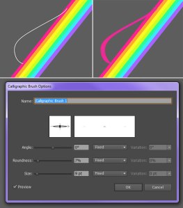
To draw the dimensional bump in the rainbow, use the Pen Tool (P) to create a small curving stroke (see below). Set the Stroke Color to match the first rainbow stripe. In the Brushes panel, create a New Calligraphic Brush with the attributes seen below (the goal is for it to be flat and ribbon-like).
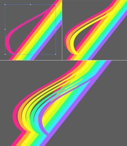
Step 3
When satisfied with the rainbow ribbon stroke, Expand it under Object. Use the Direct Selection Tool (A) to make sure its corner anchor points align with the first rainbow stripe. Copy and Paste the bump shape and use the Eyedropper Tool (I) to select each rainbow stripe color in turn. Line up seven of the bump shapes, parallel to the rainbow stripe group. Group the rainbow bump shapes together. Copy, Paste, and Rotate this group for the opposite end of the rainbow stripe group.
5. Render the Rainbow
Step 1
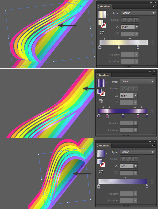
Copy and Paste the rainbow bump group. Ungroup and Unite the shapes together in the Pathfinder panel. Apply a Linear Gradient that goes from dark purple at 0% Opacity to light yellow at 100% Opacity back to dark purple again. Angle the gradient so the highlight appears in the center of the group. Repeat for the bump on the other end of the rainbow.
Copy and Paste the main rainbow group. Ungroup and Unite the shapes together in the Pathfinder panel. Apply a Linear Gradient that goes from dark purple at 100% Opacity to magenta at 0% Opacity back to dark purple, back to magenta, and back to purple again. Angle the gradient so the shadows (dark purple) appear at the edges of the rainbow stripe and beneath the splash design from Section 3. Place this shape underneath the rainbow bump groups in the Layers panel.
With the Pen Tool, draw an angled rectangle underneath the rainbow bump group that goes from dark purple at 100% to 0% Opacity. Concentrate the shadow beneath the main curve of the bump group.

Step 2
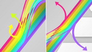
With either the Pen tool or the Pencil Tool, draw curving arrow shapes of varying colors coming off the rainbow stripe. I chose to draw two on each end of the design.
Step 3
Group together all of the rainbow components and place them beneath the splash shapes group in the Layers panel. I added another gradient circle in the central shape to give it more depth.
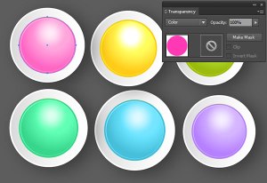
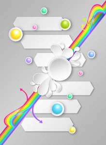
6. Colorful Circle Shapes
Step 1
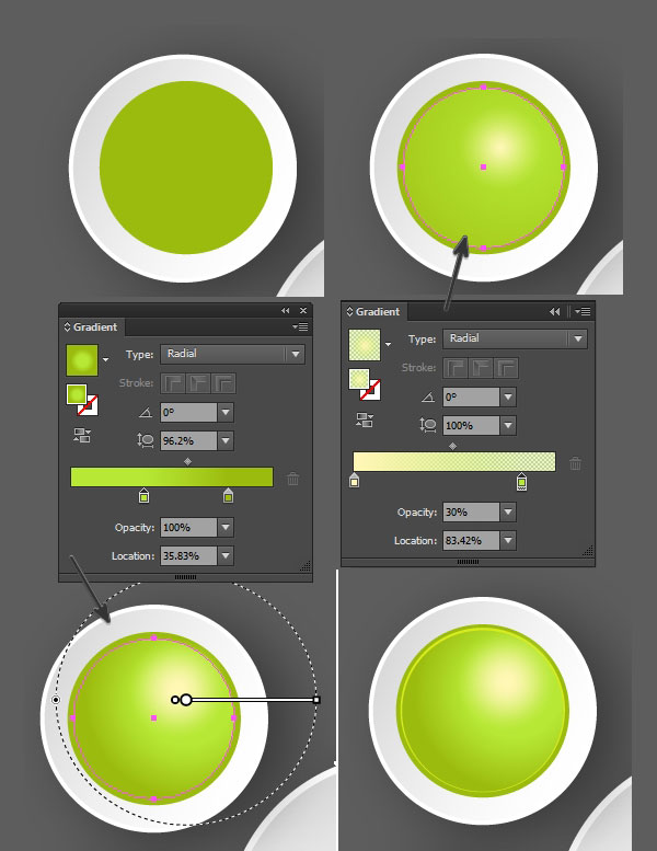
Copy and Paste the central circle shape (without the newly added gradient shape from Section 5, Step 3). Draw a circle in the center with the Ellipse Tool. I chose bright green for this design.
Draw a smaller circle and apply a Radial Gradient that goes from light yellow at 100% Opacity to the base green at 0% Opacity.
Copy and Paste the highlight circle and apply a Radial Gradient that goes from bright green to a darker green. Place it below the highlight circle in the Layers panel. This will give the green circles a more dimensional look.
Finally, draw another circle, smaller than the main green shape but larger than the two gradient circles, and set the Fill color to Null and the Stroke to 1 pt weight and a bright lime green. Group everything together.

Step 2
For varying colors, Copy and Paste the colorful circle group as many times as you need for your design (note there are several colorful circles in the final product). Draw a circle that overlaps the green color and set its Blending Mode to Color in the Transparency panel. The color you choose and the color you made your circle design in the previous step will affect the hue of your colorful circles. Alternatively, you can just repeat the previous step with different colors and have full control over what your circles look like.
Step 3
Copy, Paste, and Resize the circles around the Artboard to your liking. I wound up with ten in total within my design.
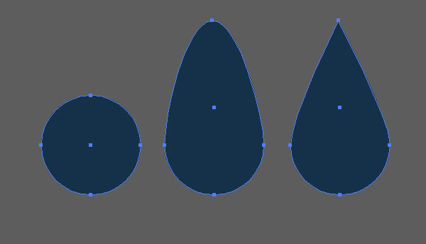
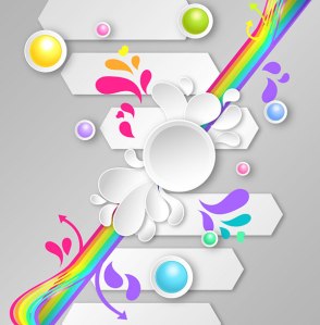
7. Colorful splashes
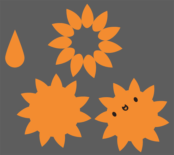
Step 1
The final set of steps involves bringing the whole design together with some colorful splash shapes. Once again, use the Pencil Tool to draw curving teardrop-like shapes around the artboard in various rainbow colors. I added in some heart shapes for good measure (and because I tend to like adding hearts to my artwork).
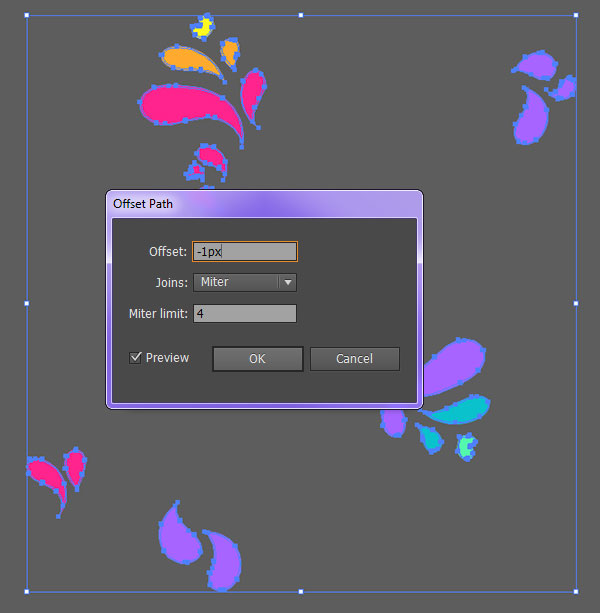
Step 2
Group together the splash shapes and Offset their Paths by 1–2 pixels.
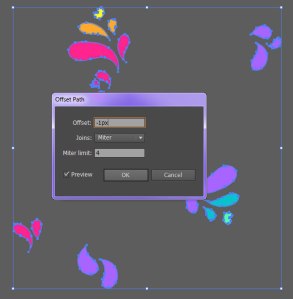
Step 3
Like the white splash designs, apply a Linear Gradient to the inner shape on each going from gray to white. Set the Blending Mode to Multiply in the Transparency panel and adjust each shape’s gradient using the Gradient Tool so they resemble the ones drawn before. Note how all of the splash designs look as if they have concave centers.
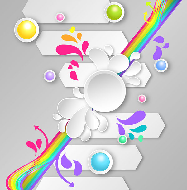
Put It All Together!
Place your colorful splash group beneath the rainbow group in the Layers panel. Aside from Drop Shadows and gradients, the overlapping of objects gives the design depth. Push your work further with an assortment of abstract designs featuring the techniques explored in this tutorial. Show off your poster designs in the comments section below.


![78]](https://harisinwijaya.files.wordpress.com/2014/10/78.jpg)